The Positive Psychology of Color – Part 2: Light Colors

How to use color to convey in interior design

In Part 1, we began our discussion about the psychology of color. Using color to expertly influence the way people experience a space is a very powerful tool. Have you ever visited a model home and been stunned by how serene the bedroom is or how welcoming the family room is? That’s because professional interior designers know exactly how to use color to create a room that makes you say, “This space is absolute perfection!”

Now you can give it try too, by using our handy guide to what colors mean. Have fun with it, and try to get creative by thinking of ways to combine colors for an overall effect. For example, rather than just choose light pink because you want a room to feel youthful, combine it with aqua so it also feels dreamy! The possibilities are endless, have fun!

Light & Medium Colors

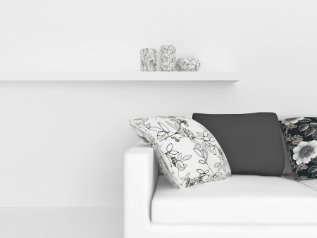
White – innocence, purity, clean, new

Amethyst – restorative, protective, peaceful

Aqua – water, refreshing, cleansing, young, cool, dreamy, soft, light

Ivory – classic, neutral, soft, warm

Light Blue – calm, quiet, patient, peaceful, cool, aquatic, clean

Light Pink – romantic, affectionate, compassionate, soft, sweet, tender, delicate, innocent, youthful

Light Yellow – cheery, soft, sunny, warm, sweet, easy going, pleasant

Light Green – calm, quiet, soothing, airy

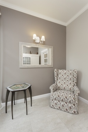
Peach – nurturing, soft, funny, delicious, fruity, sweet, fragrant, inviting, warm, comfortable, modest

The Positive Psychology of Color Part I

How to use color to convey in interior design

Have you ever thought about deciding the color scheme of your home based on the psychology of color? Certainly, it’s perfectly fine to go with your favorite colors, but one of the great things about knowing how color affects the way people experience a space is that you can create an ideal setting.

This doesn’t mean you have to forego colors you love, but the meaning of color is so effective that it actually changes with the intensity of the color. For example, the color blue can be light, dark, bold, pastel, etc, and each of these is a little different. Selecting a certain shade allows you to create a very specific effect! Intrigued? Keep reading Part One – Dark Colors. Then check out our other blog posts that explain additional options!

Dark colors:

  • Amber – multi-cultural, mellow, abundant, original
  • Black – powerful, elegant, sophisticated, mysterious, bold, basic, classic, strong, expensive, magical, night, prestigious, stylish, modern
  • Brick Red – warm, earthy, established, strong
  • Charcoal Grey – reliable, responsible, accountable, conscientious, resolute, restrained, conservative, professional, classic, sophisticated, enduring, mature, business
  • Chocolate Brown – scrumptious, rich, robust, appetizing
  • Deep Blue – credible, authoritative, basic, conservative, classic, strong, reliable, traditional, service, nautical, loyal, confident, professional, clarity
  • Deep Purple – visionary, wealthy, royalty, prestigious, subdued
  • Dark Green – nature, trustworthy, refreshing, cool, restful, stately, mountains, hushed, woodsy traditional, reliable, money, prosperity
  • Foliage Green – natural, fertile, healthy, balance, life, growth, soothing, harmony, restful, restoration, lively, spring, renewal, lush
  • Teal – serene, cool, tasteful, sophisticated, confident
  • Vibrant Dark Orange – fun, whimsical, childlike, happy, glowing, sunset, hot, energizing, active, gregarious, good natured, spontaneous, optimistic, talkative, jovial, sociable, self-assured, persuasive, animated

Using Animal Prints to Spice up Your Interior

We often place emphasis on using different color variations to liven up the interiors of our home. However, animal print is a palette that often gets neglected. In fact, using animal prints in your decor will take your design scheme from bland to exciting. From accessories, furnishing, and textiles, animal prints can be used in many ways to liven up your decor. Today, we are going to take a look at five ideas for incorporating animal print. Let’s take a look!

Mixing and Matching Prints

Can you not choose between leopard print and stripes? Who says you cannot use them both? You can mix and match animal prints with other types of patterns. The best way you can achieve a mixed print and pattern look is to unite them with color. In addition, when pairing print variations, you should keep the animal print small so that it does not clash. If you are not ready to start mixing and matching prints, you can purchase pieces over time until you warm up to the idea of space full of different prints.

Use Artwork to Balance Prints

Are you afraid that you will create a space that looks like it should be in the middle of a Safari or jungle? If so, you can use artwork to balance out the prints you use in a space by incorporating sculptures, animal paintings, or artwork that uses some of the same colors of the prints you are featuring. Seek out different types of artwork from online vendors or your favorite home decor outlets for optimal results.

Pairing Solids with Animal Prints

Using your favorite animal print against solid surfaces and furnishing makes for a great accent. Cheetah, leopard, and giraffe prints stick out from neutral tones. Using animal prints with natural colors like brown, white, and even dark green can help balance the prints with the rest of the space.

Forms of Animal Prints

There are numerous possibilities for animal prints. You can purchase them in upholstery, fabrics, and textiles. However, you are not limited to textiles and upholstery. You can use animal prints as embellishments on your furniture, picture frames, and lamps. Also, you can see such prints in other accessories like wastebaskets.

Do Not Overdo It

While there are a variety of ways to implement your favorite animal prints, be careful not to overdo it. Be selective with your prints so that you do not create a space that looks unflattering or even tacky. It is all about finding balance.

What are your thoughts on animal print? Do you feel more open to incorporating it into your design after reading these tips? Let us know your thoughts below in the comment section.

Are Floral Prints Back in Style?

Florals prints use to be considered very retro. This style can be affiliated with “grandma’s couch” or your “old aunt’s wallpaper.” However, this retro styling is coming back into eccentric design styles. We saw these prints slowly come back into style in fashion in the spring of 2018; however, this year, they did not slow down. The craze for floral print designs trickled right into interior design. So, the question is: “are they here to stay or just a fad?” Let’s take a look!

Floral Prints and Biophilia 

Floral prints usually are based on patterns. These patterns use repetition to help create a dramatic effect. Patterns are always an essential element to consider in design. Likewise, Biophilia is also a belief that makes floral prints more important. For centuries, many people affiliate that happiness in design is capture by incorporating elements of nature. Natural skylights, indoor plants, hardwood floors, and many other elements all help contribute to this belief. Likewise, floral prints are no exception and allow both plants and patterns to unify in the design to help enhance your space. 

Fashion and Design 

It can sometimes be overlooked how closely interior design and fashion replicate each other. This is the easiest way to notice trends and forecast where designs are going. Floral prints have made their way back into fashion and thus have made a significant impact on interior design. We have seen dramatic increases in curtains, throw pillows, and bedding all incorporating more floral patterns than ever.

What is Next? 

We see patterns go through different phases. Perhaps, stripes did not get enough attention in the prior years and are coming back into style. We notice slight increases in stripes in fashion, but does this mean floral is gone? Not quite. Floral may be a trend, but it also plays some crucial role in incorporating nature and patterns into interior design; therefore, we believe it is here to stay.

By adding floral patterns to your home, you can keep your home feeling relevant and trending. These powerful designs not only give homage to the classic retro styling but also feel very modern and fun. Try adding some creative floral patterns to your home this summer and enjoy the many benefits they have to offer to your home’s aesthetics. 

Patterns: How to Incorporate Florals in Your Home

15359994_SPatterns are a major trend in fashion and interior decorating.  Floral patterns are back in and hitting the scene full on when it comes to home décor and design.  This particular pattern might remind you of floral patterns from your mom or grandma that just may seem dated.  You can add floral accent pillows, floral vases, and even bring in florals with actual flower arrangements to keep your home looking and smelling fresh. Here are a few ways to incorporate today’s floral trends at home.

15285253_SIf the image above made you rethink using florals in your home, there are other options.  You could take the pattern above and place it in a frame to hang as a piece of art on the wall.  The image to the right, uses the pattern more subtly.  Using a black and white color palette keeps the room looking neutral and classic. The floral accents are able to stand out, but are less invasive to the eye.  Using accent pillows is a great way to test out if you’ll enjoy using floral patterns throughout your home

21279654_S

since they can easily be traded out.  It would also be fun if you traded these black andwhite floral pillows for pastel floral pillows during the springtime.  The candles on the shelf are a similar style and, again, are easy pieces to move in and out of the room.  Duvet covers are another great source if you want to experiment with subtle or bold floral patterns in your bedroom.  The duvets will most likely make your bed become the focal point of the room.

18969410_SIf you already know you’re in love with adding floral patterns in your home, maybe try to incorporate them with more long-term methods like purchasing a floral patterned accent chair like the one to the right.  The chair becomes the focal point of this seating area.  Decorating around it is easy with a simple side table, mirror, and lighting.

You could also make an accent wall with floral wallpaper or floral stencils.  However you choose to add florals into your home, they’ll be sure to add more depth and interest to your design.  Whether it’s through accents, major pieces of furniture, or small décor pieces we hope you enjoy the floral pattern as much as we do! 

Area Rugs Define Spaces

An area rug can serve as artwork for your floor. On top of wood or tile floors or even carpeting, area rugs define conversation spaces and pull colors together while adding texture.

This birds-eye view provides some insight into how an area rug can enhance a room’s look. The rug is primarily rust and brown, and it has tones ranging from light to very dark. This variation captures and connects every other element in the room.

The lightest tones in the rug are reflected in the maple coffee table and the fireplace surround. That light wood wouldn’t work as well if placed directly on the warm mid-range wood flooring, but the rug allows it to serve as a dramatic contrast.

The black of the fireplace opening and tools connect with the dark outlines of some of the leaves in this rug. Two different shades of rust making up the sofa and chair hang together well thanks to the choices of color in the rug itself. Finally, the rug clearly defines the living space in this part of the home, providing a frame for the furniture.

The photo to the right demonstrates another way an area rug defines space. This corner is created by focusing on the space left where the rug’s border ends. A comfortable reading chair under a window becomes a special private nook, with a couple of tables for a cup of tea or a pair of reading glasses.

When you use area rugs to highlight specific design features in your home, the extra layer adds charm to your décor.  Contact us or come to Browse Night and take a look at our new line of beautiful and well-constructed Feizy area rugs or just to get more insight into how area rugs can complement your design plans.

Decorating with Rustic Contemporary Style

When you first hear contemporary and rustic together you may think they don’t fit. How can the clean, sleek lines of contemporary style work with the imperfect, rough surfaces and designs of rustic style?


This is a surprising style combination that does indeed work, and work well together. The saying opposites attract certainly applies to contemporary rustic style.


This living room is a beautiful example of the two styles working together to create a new and interesting style.  Contemporary rustic style isn’t the same as eclectic style, which marries a few different styles into a single room.  Contemporary rustic is much more streamlined and has its roots firmly in contemporary style.  Rustic additions add a handcrafted element to the smooth, machine made surfaces of contemporary furniture.


The sleek contemporary chaise in this living room is paired with a rustic low bench that is used as a coffee table. A roughly carved bowl and primitive sculpture create a vignette on the table. Other rustic elements in the room include the floating shelves. These shelves appear to be made of reclaimed wood, a popular material in contemporary rustic design. In fact, reclaimed wood floors are a popular choice for contemporary spaces.  The reclaimed wood floors add texture and interest to the minimalist designs of contemporary style.


Mixing styles like rustic and contemporary is about finding harmony between the two styles.  This room is successful because it retains its contemporary style but includes a few handcrafted rustic elements. This rule would work for global or ethnic accents in a contemporary space, too.