What do color choices say about your home? Part II

Your color choices in your home can say a lot about you and the overall environment. Therefore, knowing when and where to use colors can help you master how each room feels. Combining colors can help influence different feelings as well. As we explored in five colors in part one, we saw how different colors can have significantly different impacts on an environment. Today, we will look at several more common colors used in design themes. Let’s get started!

Purple

Purple is known as a mysterious yet spiritual color. It is a compassionate color; however, it can make for a more calming atmosphere. Using purple is a perfect way to create a luxurious or imaginative environment while being very versatile.

White

This crisp color can make any room feel clean and spacious. White is a heavenly color that is pure and feels very refreshing. It pairs best with cool tones more than warm tones, which is vital to know when designing your space.

Green

If you are trying to add more life to a room, green is the color of choice. It can help revitalize and energize a space. Also, it subconsciously reminds us of plant life, which can help invigorate any atmosphere.
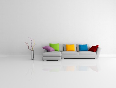
Gray

Gray can steal benefits from both white and black. While sophisticated and classy, it can also keep a room feeling more open and spacious. It is still neutral and leans toward black for more benefits, or you can go light to explore more white inspiration.
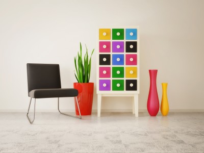
Yellow

Yellow is a creative color to use in a room. It is very eye-catching as it is used to capture attention. It will radiate throughout the room, making it feel more optimistic and charming. In essence, you can add more energy to a room by using yellow.

What colors do you use in your own design? There are so many ways we can add color to our homes to help give them life. Knowing these characteristics can help you tailor a room to your specific needs.

Decorating with Your Colors

11052685_SWhen you were little, chances are you didn’t limit yourself with color. Drawing with crayons, colored pencils or paints, most children will use almost every color in the box.

What happens when we grow up? Suddenly we seem to limit ourselves to a very few options from the rich selection available. Walk through your home and peek in your closet. How many of these colors can you find? Are you seeing lots of the grey, brown and black, or are you letting your bright side show?

8064776_SHere’s a low-risk introduction to more color. Throw pillows are inexpensive, portable and temporary. This room shows what it looks like when you dip your toe into color. It’s better, but it’s a pretty wimpy leap into the spectrum.

Take a look at the vignette below. Here colors play a starring role. The chest grabs six different hues from the pencils above, and the vases and pot add more. The neutral background and flooring and splashes of black simply showcase the colors more strongly.

8960162_SWhat was your favorite color as a child? Do you see it in your home? Purchase a box of crayons and count the colors you see in your life now. Have you accidently gone kind of taupe? It’s time to make a change.

Pick out your favorite crayons from the box and go shopping. Would you like a bright blue vase? How about a red glass bowl or a yellow side table? Have some candlesticks that you’re tired of – how about spray painting them all orange and setting them on a table together?

Bring your favorite colors back into your life – in your home and your wardrobe. You may be surprised at how well they brighten your days.

Décor Choices Bring the Sun Inside

5128757_SWe’re fortunate here in Arizona to live in a climate that gives us so many sunny days. In many parts of the country, this time of year presents gray, dark weather with plenty of rain and snow. But no matter the weather outside, you can bring the sun into your home by choosing the right colors, accessories and fabrics.

Take a look at the curtains in the photo to the left. The soft rust tone of one curtain combined with the second rich gold fabric curving over the top feels like a perfect balance of sunshine and shadow. The metallic layer on the gold curtain adds shine to the sunshine message, and the sparkles on the two-tone tassel also contribute.

10866785_SIt may be tempting to stay with the bright gold shades, but notice what happens in this photo thanks to the darker rusty orange. The contrast makes the gold seem even brighter and stronger. When you decorate your home, it’s best to use contrast to emphasize your style. Staying in the same tone range creates an uninteresting room. In this shot the contrast comes through in several ways: on the fabric, tassel and the braided tie holding the upper curtain back.

You don’t have to go for the traditional, almost baroque feel shown above to bring sunshine into your home. Take a look at the photo to the right.

Orange, gold and brown work together to create a sunny space. The metallic gold art is brightened by the contrasting dark mats and frames. In the same way, the metallic decorations on the pillows and bed runners really pop thanks to the dark brown base of the ribbon. Notice how that orange wall has depth and power. It probably took three or more coats of paint to obtain that richness.

Do you want a room that spells out sunshine? Consider these colors and an introduction of warm metallic elements to bring the sun into any room in your home.

Mix of Colors Pop in Kitchen

Did you ever wonder why some spaces just seem more colorful than others? Well, one reason is the result of using complementary colors in a room. Complementary colors sit on opposite sides of the color wheel.

The primary complementary colors are orange and blue, yellow and purple, and red and green. If you put bright versions of these color pairs next to each other they will actually seem to vibrate. However, you may not want to use the strongest versions of those colors. Instead, choose a slightly different, lighter or darker shade to take advantage of the contrast without creating too much of a color conflict.

This kitchen, from the Fulton Homes Rancho Mirage model at Oasis at Freeman Farms, uses a coral shade of red and a few yellow-green hues combined to add color to the space. Although the fundamentals in this room – cabinets, flooring, countertops and appliances – are neutral, the careful addition of colorful accessories makes the room feel full of color.

This design concept continues onto the great room sofa visible in the foreground. Once again the larger piece – the sofa – is neutral but brightened by two throw pillows which echo the coral and green colors visible in the kitchen. The fun thing about this approach to color is that it’s easy to change out your choices without spending a lot of money. Paint, pillows and accessories could be adjusted with the seasons or even your mood.

Do you want more color in your home? Don’t let your current neutral decor keep you from adding pops of whatever colors take your fancy.

Thinking about Walls: Dark

How daring do you want to be with your walls? Would you risk painting your walls this dark?

As you can see, it’s a dramatic look that works very well here. Let’s take a look at the choices that make a midnight black wall work in this room.

To start, plan to paint multiple coats to get this rich a tone. When you choose a dark shade, at least three coats are generally needed to build depth of color. You may be able to get away with two if you use a tinted primer, but don’t hold back – an extra coat or two will really make a difference.

Next, take advantage of contrast. The bright white sofa and chair upholstery help the walls pop and make the room feel light. Take a look at the mirror frame and the curtains. Once again, the pure white works well with a dark, dark wall. Adding the brown pillows provides a contrast on top of contrast. This contributes to the drama of the space.

Make sure the lighting lets the space feel open and inviting. During the day this space stays well lit thanks to the two large windows. At night, look for lighting options that pull light into corners and highlight the shine on this luscious floor.

Notice that we’re working with white, black and brown here. There are a few plants, but they play as neutrals rather than color because they are living elements rather than accessories. A splash of color – yellow, red or orange – would make a fun element.  Are you ready to take a chance?

Brighten up a Room with Splashes of Color

We’re lucky here in Arizona to get so much sunshine. Grey days are the exception here. But it’s easy to let our homes go grey or beige inside because of the fear of committing to colors. If you have neutral walls, sofas, flooring and chairs, you can still add bold color to your home. Here are some ideas for brightening up any room.

Rugs: No matter what your flooring choice, a rug can add color, warmth and focus. Look for color that you love that will work with your furnishings. Since rugs are not permanently attached to your home, take the opportunity to be more daring with colors.

Art: A large painting or print in vivid tones can light up a wall. You can find options at one of the art shows around town, or in a shop that sells posters and prints. If you love good photography, visit the National Geographic website and you can select a photo to enlarge among their rich collection that is ready to purchase. Or maybe you’re a good photographer yourself. Warehouse stores will enlarge any print you have and even create a version on canvas for very reasonable prices.

Throw Pillows: This simple update can connect other color splashes in your home with your furniture. They’re also easy to change out if you get tired of them. If you’re still nervous about color, buying a bright throw pillow is a great non-threatening start.

Accessories: A red glass vase or blue pottery bowl can add a colorful element to any room. Consider textiles such as a table runner or placemats in your dining room. Pick things you like but watch your tendency to go with more neutrals. Neutral accessories in a neutral room will disappear into your space.

So take a chance with color. Start with one piece, then two, and before you know it your home may be colorful as well as inviting!

Colors Set a Mood

How do you decide what colors to use in your home? You may have a favorite color that you want to incorporate into your home, or you could prefer to stick with neutrals, but color choices are more complex than that. Colors affect our emotions, and the right choices can make your home more inviting and comfortable. Here are some of the basics of how color affects us.

Red: This is an energizing color. It’s a great color to associate with food and entertaining. It’s flattering to people’s complexions and encourages interaction. That’s why it’s a particularly effective color in dining rooms.

Yellow: This color makes people’s complexions look sallow, so it’s a bad choice for bathrooms. It is an optimistic color, however, and helps build self-confidence. That makes it a good choice for many other rooms. Its energizing nature, though, means that it’s a mistake in bedrooms and a really bad choice for nurseries unless you want your baby to be up all night.

Blue: The most relaxing color of the spectrum, this color is an effective choice for bedrooms. This also means that it’s a bad choice for dining rooms, unless you want quiet and boring dinner parties.

Green: As a natural tone, it’s a stress-reducer that can help people keep their emotions balanced. It’s a good relationship color, which makes it great for living spaces.

Orange: A stimulating color, it’s best used sparingly in a home. It creates a lively mood. This makes it a good choice for restaurants because it will stimulate conversation and enjoyment.

Purple: This is actually a good color for quiet thinking – it can help create insights.

When you plan the colors in your home, you may want to consider what you want to accomplish in terms of mood, and let your colors reflect those choices.