Movie Design Inspiration: Breakfast at Tiffany’s

16689959_S
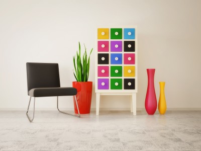
In honor of the Oscars last week, let’s celebrate movies by looking at how films can inspire room designs.

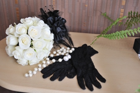
“Breakfast at Tiffany’s” provides a classic image of black, white, pearls and more than a bit of excess. The film made the little black dress with pearls a look that is always in style.

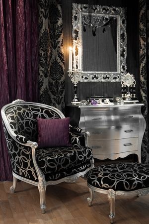
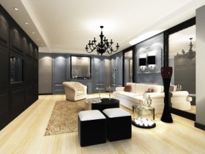
You don’t need a little black dress in your closet to set the stage for a room with a sophisticated and glamorous Tiffany feel. Start with black and white – a combination as classic as the movie. Black needs to be the strongest element, with only a few white elements for contrast.

10329773_S
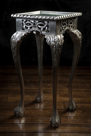
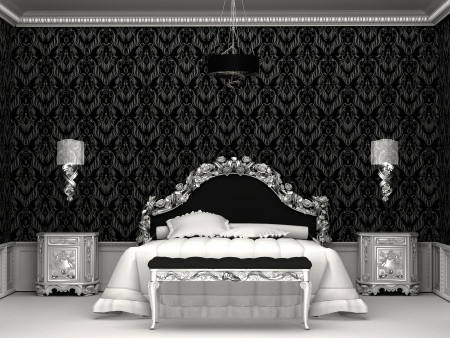
The next step is some serious bling. The room to the right demonstrates this with the headboard, bench, sconces and nightstands sporting a metallic gloss. It really doesn’t matter whether the metal choice is silver or gold – it’s the sparkle that matters.

Notice also the ceiling molding. The edge looks something like a string of pearls – apropos for the Tiffany look.

Want to add a touch of color? The best choice to bring the movie to life would be Tiffany blue – that classic light color that covers every box from Tiffany’s.

8334795_SNo one who has ever shopped at Tiffany’s ever forgets their particular shade of blue –as much a part of their brand as the name and the store itself. If you’re fortunate enough to receive a gift from that store wrapped as the package on the left, it’s almost impossible to toss that box.

A throw pillow, vase or small box in Tiffany blue would give your room the final touch – and maybe you will feel just a bit like Audrey when you’re in it.

Personalize your Home: Color

15825954_SDo you find yourself always choosing “safe” neutrals when you make a purchase for your home? Well, maybe it’s time to add some of your favorite colors!

If you’re not sure where to begin, take a look at these ideas to kick-start color in your décor.

It’s just paint: This seems like a daring place to add color, but it’s actually one of the easiest and least expensive ways to change a space. Here’s a suggestion. When you’re looking at paint samples, move down the color cards to the rich darker tones at the bottom. Then get sample pots of several of your lighter choices and a few of the brightest hues.

Now, challenge yourself to paint at least one wall with the vivid shade. Use the sample pots to see which wall and which color works best for you. Be sure to live with those sample colors for at least a week. You may find that a color that was startling at first grows on you over time.

20700581_SPlant a pocket of color: Whether it’s bookshelves, a guest room or some simple storage in the kitchen, consider adding a splash of various colors in combination. Take a look at how appealing the vivid mix of tones appears on the right. Simple lines pop when you add color to the mix.

Take a chance: Instead of a brown leather sofa, how about choosing one of the colors shown below? The rich blue, warm olive green, or even one of the daring reds could turn your safe living or family room into something dramatic and inviting.

Does a sofa seem just too much? Why don’t you start with a chair; then add some color in a rug. You never know, you may end up with a home as bright and colorful as you are!19877392_S

Silver Gives a Touch of Winter

5602580_SIf you have children – particularly little girls – you’ve probably seen Frozen. The story, the music and the characters are delightful, and the scenery really puts winter front and center.

For those of us who live in Arizona, winter is not the icy adventure presented in the Disney movie, but you can bring a hint of winter’s splendor into your home using silver.

More and more, metallic paints liven up old pieces of furniture such as the bombe chest shown in this photo. Add an old-style upholstered chair and ottoman with silver leaf on the wood and rich modern black and silver upholstery, and you’re headed for your own winter design.

Black is the perfect pairing with the shine of silver, setting it off while providing the perfect addition of drama. Notice the dark burgundy silk throw pillow – a touch of dark red or turquoise will spark the black and silver with a bit of color. The silver-framed mirror, chandelier visible through the glass, and the selection of silver accessories finish up the room into something you would expect to see in Elsa the queen of Arendelle’s bedroom.

19419998_SYou can create your own silver furniture simply. Look in thrift and antique shops for a table, chair or framed mirror with some character such as the occasional table in the photo to the right. Choose something inexpensive, possibly with a damaged finish, so you aren’t covering a beautiful patina with paint.

Wash the piece and sand lightly. Before painting, wipe it down with a tack cloth to remove any dust. Look for a good quality silver spray paint. Take it outside to protect yourself against the fumes and set it on a drop cloth or newspapers to protect your landscaping. Spray the piece, using several light coats to finish it completely.

So maybe you really don’t want to recreate a Disney film set in your home. You can still bring a bit of winter silver to a corner of any room that could benefit from the additional splendor.

Design Inspiration: Set a Cozy, Rainy Mood

9851687_SWhat’s the best way to enjoy the rain? From inside, of course. The wetter it is outside, the nicer and cozier you feel watching out the window from your dry and warm home.

There’s no denying, however, that sometimes it’s nice to spend time in a space that gives us that fresh rain feeling without getting wet. The following spaces make that happen with good design decisions. Would you like a rainy day even in sunny Arizona? Let’s see how to make it so.

Take a look at the photo to the left. What design elements come into play on a rainy day? Start with the color. This blue typifies the rain – cool and lively – not too light, not too dark, but both darker and lighter blue tones replace blacks and whites.

Next, notice the reflections – rain makes little mirrors of the sidewalks and anyplace that collects water. Instead of the shadows you expect in sunlight, you get blurred reversed views of the people along the sidewalk.

Finally, look for the small dots created by the water falling. Nothing is simply one solid color – everything has variations in shade and texture.

7521907_SNow, look at the photo of the restaurant to the right. Yes, you have a similar blue – color is one of the quickest ways to capture a mood. But there’s more that links this space to rain than color.

Check out the flooring. The large tiles are reflecting in a way very similar to the sidewalks in the photo above. All of the lights in the ceiling and above the bar also show their counterparts on that flooring. Finally, you get the contrast of light and shadow that echoes the photo above along with color variations in the flooring itself. This room really is a rainy day.

9264456_SWant the same mood at home? Well, you may not desire quite as much reflection, but these tiles shine. The shades of blue and small tile choice mimic the pattern and texture of a rainy day. Even the mirror above the sink reflects the tiles so that it looks almost like a contained wall of water.

Cool blues, texture and color variety, and a shine that reminds you of looking at yourself in a puddle before your foot hits it and splashes the image away. Make it rain.

Fulton Homes Design Online – Colors & Textures

Std Int 2-Tone Paint ColorDecorating your home starts before you place your first piece of furniture. Choosing the right paint color provides a great start to the decorating process.

Gone are the days when every wall in a new home is painted the same Navaho White. Fulton Homes provides a choice of 12 designer colors for your walls, all 12 available in low VOC paints.

Or maybe you want to go with a two-tone look with Frazee eggshell wall paint in 16 Designer Colors? Take a look at choices online at Fulton Homes Design Online and then make your final selection at the Fulton Homes Design Center.

Doors, baseboards, casings, trim, closets, garage and ceilings will all be painted with Swiss Coffee. This soft off-white complements any wall paint choice.

You may want to bring samples of your upholstered furniture colors, and consider your flooring and cabinet and countertop choices when making your final paint selection. By spending a few minutes, you will find that the right paint choice helps bring everything in your home to a coordinated whole.

Exterior Color Scheme 24CYou have a choice of exterior paint choices also, along with Coronado stone trim. These colors are chosen to coordinate with your home’s particular elevation. Paint samples are available in both the Sales Office and Design Center. The photo to the right shows only one of the options you can choose from for your own home.

Fulton Homes Design Online also shows you the textures offered on the interior and exterior walls of your home. Browse through the “colors and textures” section and discover those options that may stay in the background, but will have a real impact in the final look of your new Fulton Home.

Decorating with Your Colors

11052685_SWhen you were little, chances are you didn’t limit yourself with color. Drawing with crayons, colored pencils or paints, most children will use almost every color in the box.

What happens when we grow up? Suddenly we seem to limit ourselves to a very few options from the rich selection available. Walk through your home and peek in your closet. How many of these colors can you find? Are you seeing lots of the grey, brown and black, or are you letting your bright side show?

8064776_SHere’s a low-risk introduction to more color. Throw pillows are inexpensive, portable and temporary. This room shows what it looks like when you dip your toe into color. It’s better, but it’s a pretty wimpy leap into the spectrum.

Take a look at the vignette below. Here colors play a starring role. The chest grabs six different hues from the pencils above, and the vases and pot add more. The neutral background and flooring and splashes of black simply showcase the colors more strongly.

8960162_SWhat was your favorite color as a child? Do you see it in your home? Purchase a box of crayons and count the colors you see in your life now. Have you accidently gone kind of taupe? It’s time to make a change.

Pick out your favorite crayons from the box and go shopping. Would you like a bright blue vase? How about a red glass bowl or a yellow side table? Have some candlesticks that you’re tired of – how about spray painting them all orange and setting them on a table together?

Bring your favorite colors back into your life – in your home and your wardrobe. You may be surprised at how well they brighten your days.

Decorating with Your Style

12221608_SIf you want to determine your style, start with looking in the mirror. How do you wear your hair? What types of clothes do you like, casual or dressy? Do you tend to wear colors or neutrals?

You choose your personal style to represent who you really are. You may find yourself drawn to retro sundresses in bright cottons, or a simple silk shell and pencil skirt. For a man, would you feel more comfortable in polo shirts and khakis or a t-shirt and jeans? Evaluating your style is a good first step when planning your home, since your taste should be just as reflected in your surroundings as it is in your wardrobe. This woman demonstrates a classic retro-40s look, with high-fashion hat and gloves and a classic black and white dress. Luxury and careful planning also show in everything about this woman’s look. So, let’s determine what sort of space would suit her style.

15750871_S

How about this room? Black and white starts the look, but it’s the style of the room that mirrors this woman. Notice the black chandelier. It’s classic, but the black updates the fixture and adds an unexpected level of sophistication.

The rug picks up the blond hair and the light flooring provides contrast with the white/ivory upholstered furniture. If this woman walked into this room, she would have just the right look for it.

Does your living room reflect your personal style? Remember that a home that matches your style comfort zone is a home that will make you happy.


Décor Choices Bring the Sun Inside

5128757_SWe’re fortunate here in Arizona to live in a climate that gives us so many sunny days. In many parts of the country, this time of year presents gray, dark weather with plenty of rain and snow. But no matter the weather outside, you can bring the sun into your home by choosing the right colors, accessories and fabrics.

Take a look at the curtains in the photo to the left. The soft rust tone of one curtain combined with the second rich gold fabric curving over the top feels like a perfect balance of sunshine and shadow. The metallic layer on the gold curtain adds shine to the sunshine message, and the sparkles on the two-tone tassel also contribute.

10866785_SIt may be tempting to stay with the bright gold shades, but notice what happens in this photo thanks to the darker rusty orange. The contrast makes the gold seem even brighter and stronger. When you decorate your home, it’s best to use contrast to emphasize your style. Staying in the same tone range creates an uninteresting room. In this shot the contrast comes through in several ways: on the fabric, tassel and the braided tie holding the upper curtain back.

You don’t have to go for the traditional, almost baroque feel shown above to bring sunshine into your home. Take a look at the photo to the right.

Orange, gold and brown work together to create a sunny space. The metallic gold art is brightened by the contrasting dark mats and frames. In the same way, the metallic decorations on the pillows and bed runners really pop thanks to the dark brown base of the ribbon. Notice how that orange wall has depth and power. It probably took three or more coats of paint to obtain that richness.

Do you want a room that spells out sunshine? Consider these colors and an introduction of warm metallic elements to bring the sun into any room in your home.

The Decorating Power of Red

8161349_SRed is daring. Red is romantic. Red is sexy. That’s one reason why it’s the color of Valentine’s Day. A splash of red makes an outfit come alive. Whether you love red or not, the color is almost impossible to ignore.

In honor of the holiday, how about looking at red in decorating? Here are three variations on using red in your home, depending on just how daring you feel.

Hard-core red: This photo shows a room where red is the dominant color. This rich dark shade of red takes over the space. Red can be a great color for dining rooms because it raises the energy level in a room and draws people together, encouraging conversation. Your dinner parties could be livelier with red walls.

The secret to this type of luminous and rich red color on your walls is multiple coats of paint. Stop at one or two and you will end up with a red that looks washed out and flat. Plan on at least three coats, and consider five. It’s a lot more work, but getting a result like this makes the effort worthwhile. Also, notice that the rest of the room’s decor is fairly neutral. Once you commit to red, really watch out for any other color choices. Red like this is generally enough color for one space.

2409263_SA splash of red: By choosing red leather for this dining room’s chairs, the homeowner adds style and a spark to the space. Once again, neutrals keep the red to the forefront without having the color overwhelm the room. You may notice that the brown flowers in the rug look almost rust against the red. This actually works because of the extremely neutral effect of the rest of the room. The red chairs ensure that the table is the focal point of the room. Remember that your eye will always be drawn to any red in your home.

8961688_SJust a touch of red: If you’re not ready to jump into the world of red full-blast, how about dipping a toe in? This light fixture provides a dramatic impact in the room and saves it from a boring neutral look. If a permanent fixture seems too extreme, how about adding in a couple of throw pillows or a vase? You could even test out your red comfort zone with a bouquet of red flowers. But you might want to wait until later in the month – those red blooms are quite expensive at the moment!


Mix of Colors Pop in Kitchen

Did you ever wonder why some spaces just seem more colorful than others? Well, one reason is the result of using complementary colors in a room. Complementary colors sit on opposite sides of the color wheel.

The primary complementary colors are orange and blue, yellow and purple, and red and green. If you put bright versions of these color pairs next to each other they will actually seem to vibrate. However, you may not want to use the strongest versions of those colors. Instead, choose a slightly different, lighter or darker shade to take advantage of the contrast without creating too much of a color conflict.

This kitchen, from the Fulton Homes Rancho Mirage model at Oasis at Freeman Farms, uses a coral shade of red and a few yellow-green hues combined to add color to the space. Although the fundamentals in this room – cabinets, flooring, countertops and appliances – are neutral, the careful addition of colorful accessories makes the room feel full of color.

This design concept continues onto the great room sofa visible in the foreground. Once again the larger piece – the sofa – is neutral but brightened by two throw pillows which echo the coral and green colors visible in the kitchen. The fun thing about this approach to color is that it’s easy to change out your choices without spending a lot of money. Paint, pillows and accessories could be adjusted with the seasons or even your mood.

Do you want more color in your home? Don’t let your current neutral decor keep you from adding pops of whatever colors take your fancy.