Pops of Color

Legacy Models 057
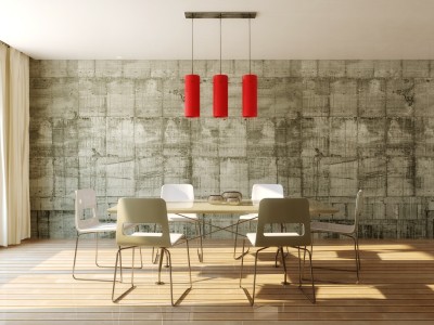
Neutrals always feel safer when you’re decorating, but staying safe keeps you from enjoying the power of color in your home. If more vivid colors seem overwhelming or just too risky, consider taking a chance with a few pops of color. Here are a few ways to let color help bring your home to life.

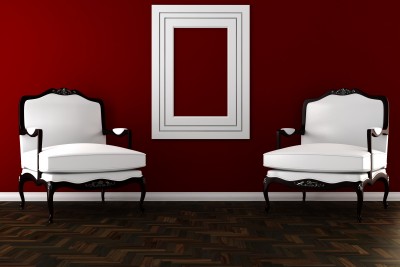
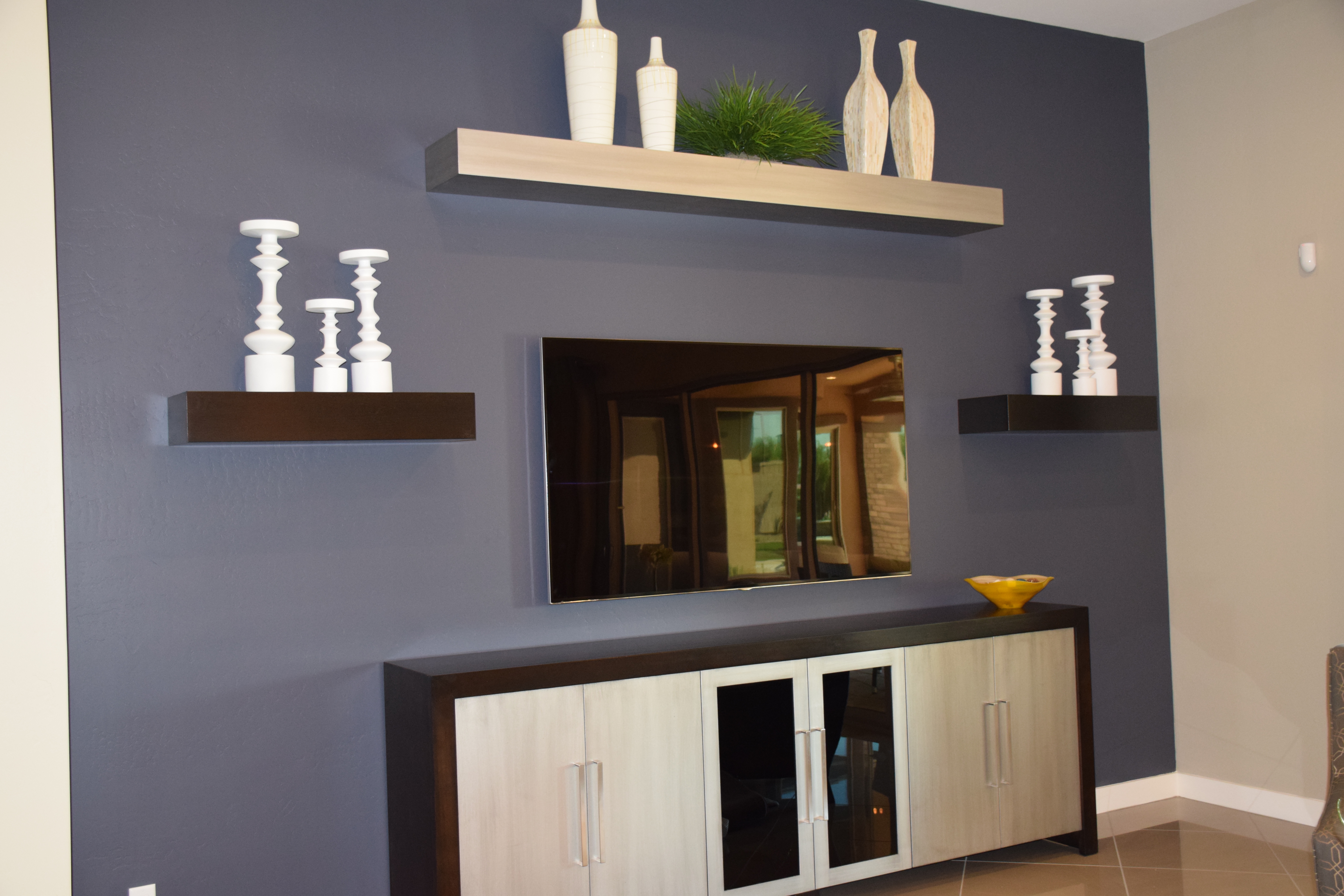
A strong accent wall: Paint, wallpaper or fabric can turn one wall into a natural focal point with a strong color choice. And the option is relatively easy to eliminate if you aren’t happy with the result. Take a look at this entertainment area in the family room of the O’Connor model at Legacy. The deep purple has enough gray in it to soften the impact on the wall, and neutral furniture, shelves and accessories keep the overall feeling rather low-key.

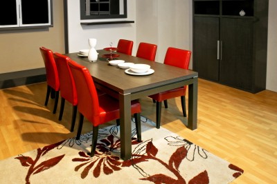
Contrasting accessories: Adding the yellow glass bowl on the right side of this console helps the space to really pop. Yellow is the complementary color to purple, which means that they are on opposite sides of the color wheel. By adding just a small touch of yellow, the purple becomes more purposeful in the space. The other complementary colors are blue and orange and red and green. If your colors seem drab, adding just a spot of the color on the other side of the wheel will add a spark.Legacy Models 027 (2)

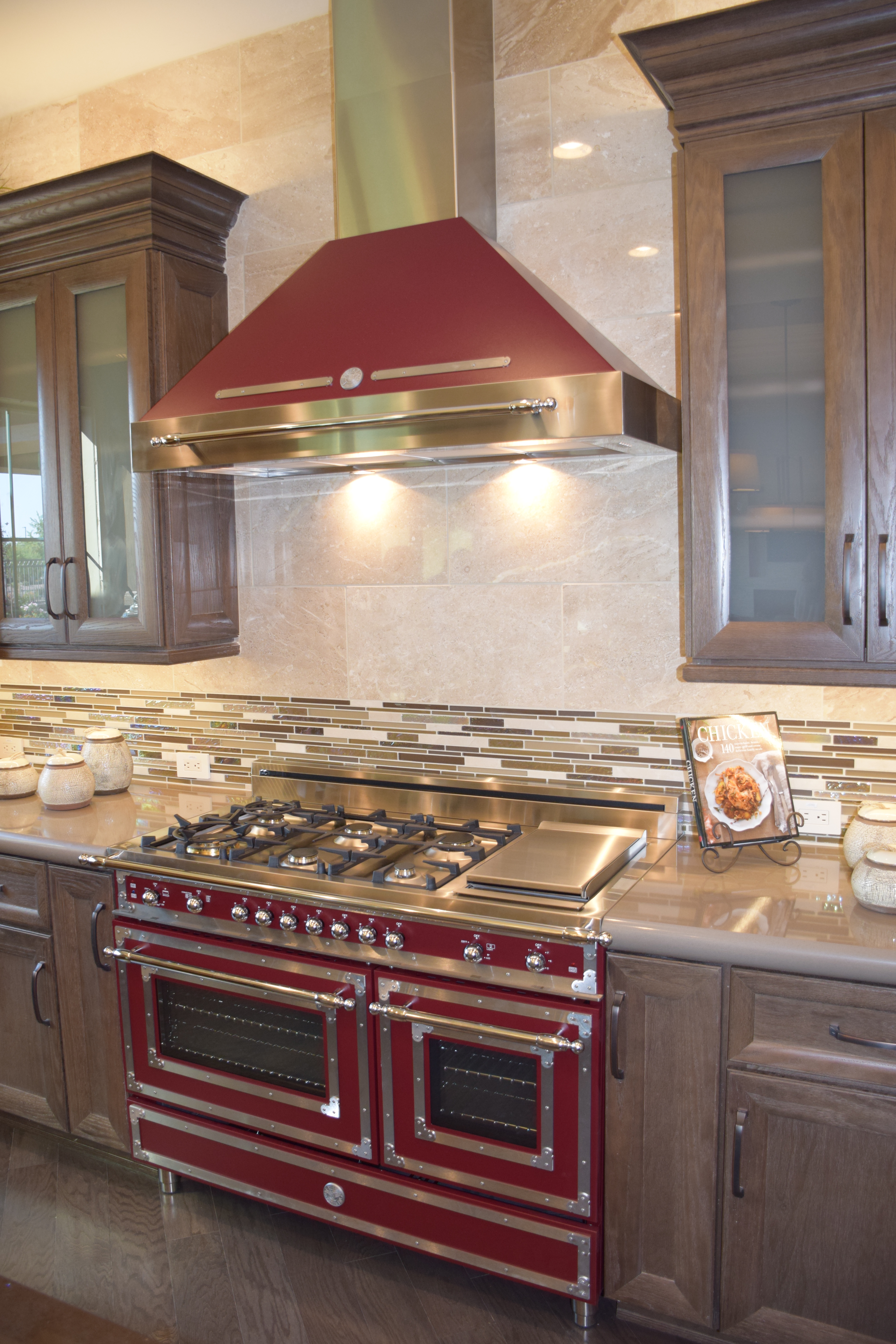
Let color infuse your focal point. This Bertazzoni Range in rich dark red creates a new energy in this kitchen. Other neutrals start to feel like the background elements, allowing this retro range to stand out. (Photo from the Fulton Model at Legacy.)

So jump into color – starting small or with a big push – and let your home’s décor pop!


Pinterest on Paint

20237301_SWhen you visit the Fulton Design Center, it has a good selection of neutral paint colors for your home. The right neutrals can make a big difference in how your home looks.

Suppose, however, you want to add some color to your walls. Visiting a paint store can seem overwhelming. If you want yellow, how yellow do you want to go? It’s easy to move from a light lemon to a horrifying egg yolk without realizing it until you see the final version on your walls.

With its strong focus on visuals, Pinterest provides a great resource for choosing the right paint colors. Instead of studying 30 different versions of the color you want, you can see various rooms with the paint colors listed. Pinterest also lists popular colors with designers which can help you determine the right choice for your home.

If you need direction for choosing the right color, several pins provide clear steps that explain a process for selection that will help ensure success. In addition, check out the many tips and tricks to enable you to tackle any painting project like a pro.

The Fulton Homes Pinterest site has a board, Painting Your Home with pins selected to help you approach painting successfully. Our board is just the beginning of the support Pinterest can offer as you begin your search for just the right wall colors to make your home perfect. While you’re at it, how about visiting some of our other boards? You may find just the decorating or design advice you are looking for!

Fulton Homes Design Online – Colors & Textures

Std Int 2-Tone Paint ColorDecorating your home starts before you place your first piece of furniture. Choosing the right paint color provides a great start to the decorating process.

Gone are the days when every wall in a new home is painted the same Navaho White. Fulton Homes provides a choice of 12 designer colors for your walls, all 12 available in low VOC paints.

Or maybe you want to go with a two-tone look with Frazee eggshell wall paint in 16 Designer Colors? Take a look at choices online at Fulton Homes Design Online and then make your final selection at the Fulton Homes Design Center.

Doors, baseboards, casings, trim, closets, garage and ceilings will all be painted with Swiss Coffee. This soft off-white complements any wall paint choice.

You may want to bring samples of your upholstered furniture colors, and consider your flooring and cabinet and countertop choices when making your final paint selection. By spending a few minutes, you will find that the right paint choice helps bring everything in your home to a coordinated whole.

Exterior Color Scheme 24CYou have a choice of exterior paint choices also, along with Coronado stone trim. These colors are chosen to coordinate with your home’s particular elevation. Paint samples are available in both the Sales Office and Design Center. The photo to the right shows only one of the options you can choose from for your own home.

Fulton Homes Design Online also shows you the textures offered on the interior and exterior walls of your home. Browse through the “colors and textures” section and discover those options that may stay in the background, but will have a real impact in the final look of your new Fulton Home.

The Decorating Power of Red

8161349_SRed is daring. Red is romantic. Red is sexy. That’s one reason why it’s the color of Valentine’s Day. A splash of red makes an outfit come alive. Whether you love red or not, the color is almost impossible to ignore.

In honor of the holiday, how about looking at red in decorating? Here are three variations on using red in your home, depending on just how daring you feel.

Hard-core red: This photo shows a room where red is the dominant color. This rich dark shade of red takes over the space. Red can be a great color for dining rooms because it raises the energy level in a room and draws people together, encouraging conversation. Your dinner parties could be livelier with red walls.

The secret to this type of luminous and rich red color on your walls is multiple coats of paint. Stop at one or two and you will end up with a red that looks washed out and flat. Plan on at least three coats, and consider five. It’s a lot more work, but getting a result like this makes the effort worthwhile. Also, notice that the rest of the room’s decor is fairly neutral. Once you commit to red, really watch out for any other color choices. Red like this is generally enough color for one space.

2409263_SA splash of red: By choosing red leather for this dining room’s chairs, the homeowner adds style and a spark to the space. Once again, neutrals keep the red to the forefront without having the color overwhelm the room. You may notice that the brown flowers in the rug look almost rust against the red. This actually works because of the extremely neutral effect of the rest of the room. The red chairs ensure that the table is the focal point of the room. Remember that your eye will always be drawn to any red in your home.

8961688_SJust a touch of red: If you’re not ready to jump into the world of red full-blast, how about dipping a toe in? This light fixture provides a dramatic impact in the room and saves it from a boring neutral look. If a permanent fixture seems too extreme, how about adding in a couple of throw pillows or a vase? You could even test out your red comfort zone with a bouquet of red flowers. But you might want to wait until later in the month – those red blooms are quite expensive at the moment!


Thinking about Walls: Dark

How daring do you want to be with your walls? Would you risk painting your walls this dark?

As you can see, it’s a dramatic look that works very well here. Let’s take a look at the choices that make a midnight black wall work in this room.

To start, plan to paint multiple coats to get this rich a tone. When you choose a dark shade, at least three coats are generally needed to build depth of color. You may be able to get away with two if you use a tinted primer, but don’t hold back – an extra coat or two will really make a difference.

Next, take advantage of contrast. The bright white sofa and chair upholstery help the walls pop and make the room feel light. Take a look at the mirror frame and the curtains. Once again, the pure white works well with a dark, dark wall. Adding the brown pillows provides a contrast on top of contrast. This contributes to the drama of the space.

Make sure the lighting lets the space feel open and inviting. During the day this space stays well lit thanks to the two large windows. At night, look for lighting options that pull light into corners and highlight the shine on this luscious floor.

Notice that we’re working with white, black and brown here. There are a few plants, but they play as neutrals rather than color because they are living elements rather than accessories. A splash of color – yellow, red or orange – would make a fun element.  Are you ready to take a chance?

Thinking about Walls: Yellow

Yellow can brighten up a bathroom or kitchen, or make a bedroom seem extra sunny. But it is the most difficult paint color to get right. The wrong choice can make a room gold instead of yellow, or turn a space into egg yolks rather than lemon. If you want to bring yellow into your home, take these steps first.

Go lighter: Yellow dominates a room much more than you would expect. Whatever tone you want, choose one at least two shades lighter. The color strips available at paint stores make this easy. Don’t worry that it will be too light. Yellow reflects off every wall and the color naturally intensifies.

Test test test: Buy a sample of two or three possible yellows. Paint poster boards, one in each color, and try them close to each other. If one of the yellows has an orange or green cast, you’ll be able to tell thanks to the contrast. Choose the purest yellow you can find. Also, put the painted posters on every wall of the room and then see which works best. Yellow changes its mood depending upon the type of light, so check in daylight and artificial light.

Combine with white: Don’t be tempted to use too much yellow. Paint the ceiling white and don’t add yellow cabinets or furniture. Too much yellow quickly takes over a room. White areas help the yellow look brighter without becoming overwhelming.

Yellow can be gorgeous or a real problem. Doing your homework at the start will give you a space that uses yellow at its best.

Fall Home Maintenance

For those of us who live in the Sonoran desert, our fall maintenance requirements are much simpler than for people in colder areas. However, it still pays to tackle several areas now that temperatures are starting to drop. Here are a few suggestions:

Check your home’s exterior. We had quite a bit of rain and wind in this summer’s monsoon. It’s smart to pop up on the roof and make sure everything is still in place. This is particularly important with an older home. While you’re up there, make sure your gutters are clean and operational. Finally, take a walk all around your home to look for signs of termites or other home challenges.

Test your heat. We will eventually get to an evening cold enough that we’ll be ready to turn the heat on again. It pays to check your heat before then to make sure it’s working well. Also, if you haven’t changed your filter recently, do so. The summer’s air conditioning demands really take their toll on filters and you will have better energy efficiency if you stay on top of them.

Trim your landscaping. In the heat of summer, it’s risky to trim bushes and trees because of the risk of sunburn on previously-protected foliage. Now that it’s cooling off you can start trimming back those plants that have gotten carried away this summer. For some plants such as citrus and roses, wait until December or January for serious trimming.

Paint your home’s exterior. The best temperatures for exterior paint are between 50 and 85 degrees. Because of our significant temperature variations between day and night, there is a small window when painting is ideal. The next month should be a great time for getting your house looking its best with a new coat of paint.

Now that the weather is nicer, outdoor maintenance feels like less of a chore, so take advantage and make sure your home looks and performs at its best.

Colors Set a Mood

How do you decide what colors to use in your home? You may have a favorite color that you want to incorporate into your home, or you could prefer to stick with neutrals, but color choices are more complex than that. Colors affect our emotions, and the right choices can make your home more inviting and comfortable. Here are some of the basics of how color affects us.

Red: This is an energizing color. It’s a great color to associate with food and entertaining. It’s flattering to people’s complexions and encourages interaction. That’s why it’s a particularly effective color in dining rooms.

Yellow: This color makes people’s complexions look sallow, so it’s a bad choice for bathrooms. It is an optimistic color, however, and helps build self-confidence. That makes it a good choice for many other rooms. Its energizing nature, though, means that it’s a mistake in bedrooms and a really bad choice for nurseries unless you want your baby to be up all night.

Blue: The most relaxing color of the spectrum, this color is an effective choice for bedrooms. This also means that it’s a bad choice for dining rooms, unless you want quiet and boring dinner parties.

Green: As a natural tone, it’s a stress-reducer that can help people keep their emotions balanced. It’s a good relationship color, which makes it great for living spaces.

Orange: A stimulating color, it’s best used sparingly in a home. It creates a lively mood. This makes it a good choice for restaurants because it will stimulate conversation and enjoyment.

Purple: This is actually a good color for quiet thinking – it can help create insights.

When you plan the colors in your home, you may want to consider what you want to accomplish in terms of mood, and let your colors reflect those choices.

Beautiful Browns in the Bedroom

You might shy away from browns in the bedroom thinking they are too dark or dramatic. Layering shades of brown can create a warm, soothing bedroom that feels like a sanctuary.  This bedroom demonstrates that you can layer several shades of brown in the bedroom and create a beautiful room.


The carved wood furniture sets the tone for this bedroom. The tall headboard set into a nook is the focal point of the room. The heavy wood furniture has a beautiful rich wood tone.  Working from this warm wood, the table lamps are done in shades of brown that play off the furniture. Keeping the walls a light color keeps the room from feeling too dark. You could also play off the richness of the furniture’s wood and go darker on the walls for a much more masculine look to the room. Deeper wall colors would create a cozy feeling in the space.


Light walls lead your eye up to the tray ceiling where the center is painted a warm taupe. Bringing a darker color onto the tray draws your eye up to the architectural detail. The warm taupe color also ties in with the wood floor as it is a similar shade.


It would be nice to see more accessories in this room. Framed artwork on the wall above the nightstands would help balance out the large headboard. Window treatments that tied in with the wood of the bed or the colors of the bed linens would give a finished look to the room.

Home Decor – Paint It Red

The primary color red is one of the strongest colors on the color wheel. Red can intimidate some people for its bold, rich color. Small doses of red can be used as an accent color to spice up a room. Buying or painting a single accent piece of red furniture is a fun way to add a pop of red to a room.


A red chair or ottoman in a living room or a red console table in the entry will create a focal point. Red accents can be in furniture, rugs, lamps or soft accessories like pillows and throws. A red bowl on the dining table or kitchen counter is a nice way to incorporate the color into a room. Even a bowl of red apples can add a little burst of red to a kitchen.


If you want to make a bigger statement, use red on furniture or the walls. Red area rugs or or multicolor rugs that have red in the pattern are less overwhelming than red walls.


Red painted furniture can be done with spray paint or traditional oil based paints for furniture. To get a good saturated color, multiple layers will need to be applied. A red lacquer is great for its deep color and hard surface—perfect for a coffee table or dining table. The shiny, glossy surface of lacquer can be imitated with a high gloss enamel paint. Durable enamel paint is a good choice for chairs and surfaces that will get a lot of wear.