Gold Tones Warm up Family Room

wWarner-Groves-at-Morrison-Ranch-072 - Copy
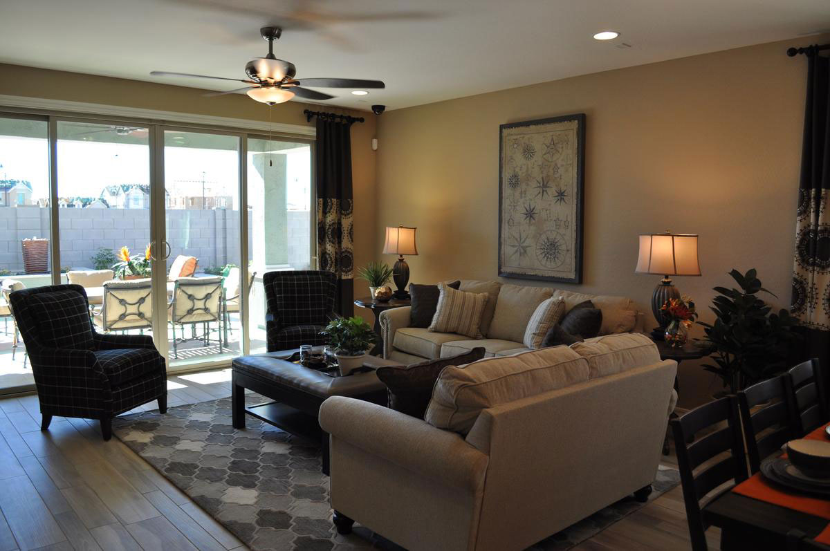
When you want to create a warm living space, consider choosing gold as the primary color. The hue fills a space with warmth. It also lends a sense of light.

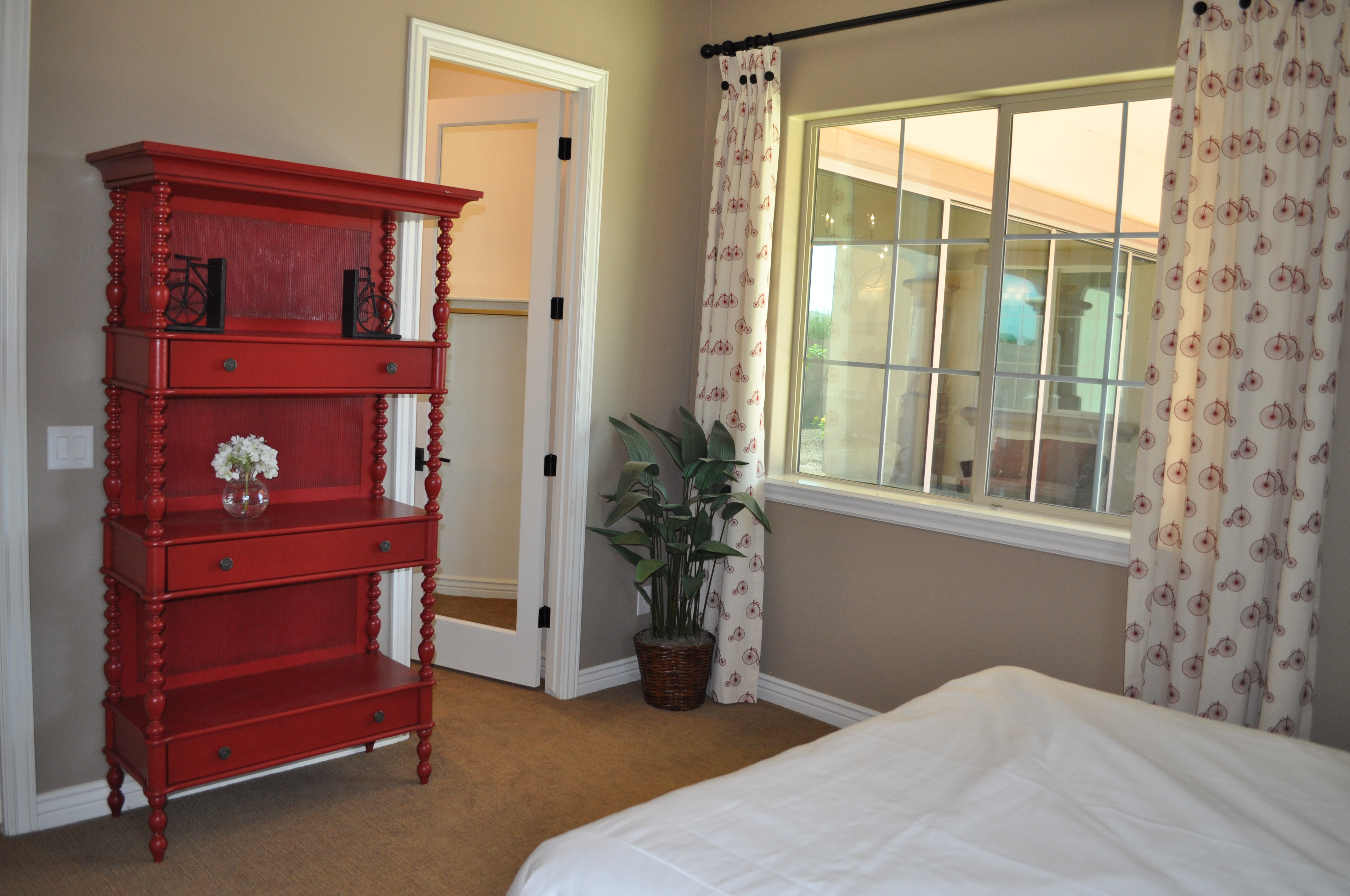
In Renaissance times, furniture and accessories were often covered in gold leaf, creating a sparkle to any space. Today gold leaf is less common, but the choice of a blend of gold tones still works in any room.

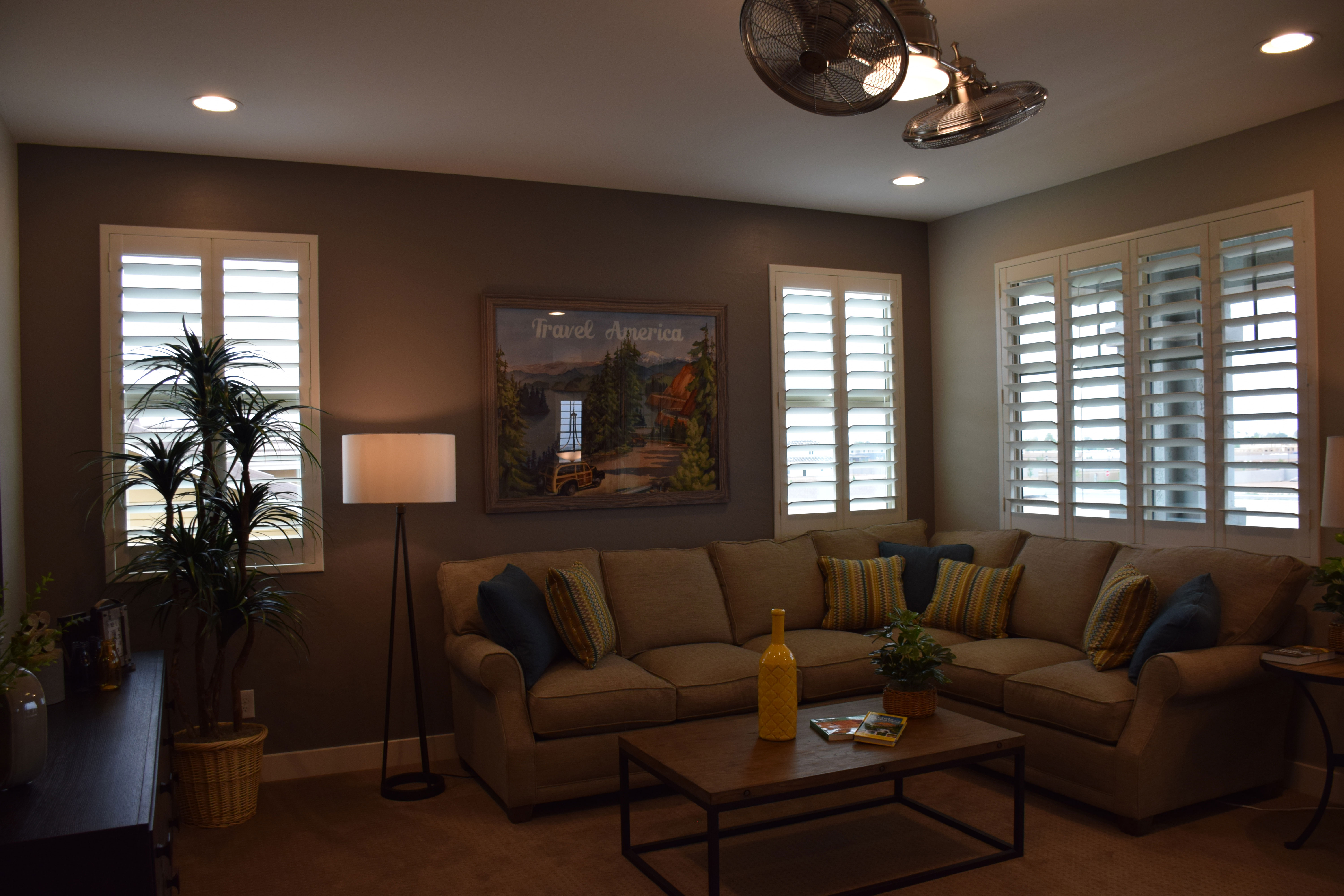
Let’s start with the gold sofa. This sectional is the primary piece of furniture in the room, and it sets the feeling for the entire space. Every other element is built around it. The pillows provide a strong contrast with the sofa and also introduce the darker and lighter elements present in the room – navy blue and a bright yellow-gold.

The cocoa color on the back wall really helps the sofa to pop, and complements the mid-tone gold carpeting. This medium shade for the carpeting is a smart choice – not too dark but dark enough to maintain the mood in the room. All of the major elements hover in a mid-range, but then the pops of dark and light tones in the artwork and accessories keep the room interesting.

Notice the artwork. It depicts a natural scene with enough bright colors to draw the eye. Pieces such as that and the bright yellow bottle on the coffee table help make the room shine.

Decorating a room with a single color makes it restful and inviting, but be sure to add those color surprises to help the room sparkle too!

Family Room Uses Brown

family-room-uses-brownwWith a strong dark grey influence, it would be easy for this family room from the Capital model at Seaboard in Cooley Station to feel cold. But it doesn’t, and that’s because of the careful use of brown. From the light brown/almost beige of the sofa and loveseat to the dark brown leather on the coffee table/ottoman combo, brown pulls in a feeling of comfort and welcome. Let’s look at the design choices that warm up this space.

Gold walls: The rich gold-brown tone on the walls creates a cozy feeling. Using darker tones helps draw people to a room, making it feel like a special club. This tone is warmer than the flooring so that together they play on the grey and brown tones that make up the color palette of the space.

Plaid chair upholstery: Plaids have always said comfort, and this windowpane pattern in dark tones brings comfort to the foreground. With the ottoman and curtains, they are the darkest elements in the room, and help anchor it without making it feel dreary.

Area rug choice: The mix of greys has an almost tweedy feel, fitting well with the plaid and maintaining the traditional comfort approach. This is a room made for wearing slippers.

Plants: Houseplants in a room always make it feel fresh and homey. Just a few green plants make a difference.

When decorating your family room, think about the choices you can make in both color and style to create an environment that says comfort, to encourage family and friends to relax and stay a while.

Dare to go Dark

dare-to-go-dark2wJust how daring are you willing to be with your master bedroom’s look? How about painting a wall this dark? It may seem scary but it works remarkably well thanks to several thoughtful decisions.

Natural light: This wall comes between two generously-sized windows. The dark dark wall provides an inviting contrast to the natural light on either side. This is further supported by having curtains on only one side of each window, allowing the dark wall to seem as if it is part of the entire window display.

Light bedding: Yes, there are darker pillows, but the primary bedspread color is cream. Once again this places light right near the dark wall. The pillows pull that spread and the wall together, serving as an effective transition.

Rich color scheme: By bringing rich colors into the room, the dark wall feels like a natural continuation of the color choices. Rich and dark tones complement each other.

Gold: Gold always works well with black. In this case the trim on the nightstands and lamps combine with the dark wood to create a warm rich feel.

Plenty of light: Even at night the ceiling fan with lights and the matching lamps on either side of the bed will keep the room well lit.

Would you like to have a bedroom with this look of drama? How about considering a dark accent wall? To see this room in person, visit Fulton Home’s Cooley Station.

Architectural Details add Luxury

La-Quinta-family-room-webIf you want to turn a room from ordinary to something special, consider the opportunity to add architectural detail.

In this family room, from the La Quinta model at Oasis at Queen Creek, ceiling choices combine to make this room extraordinary. First, the coffered ceiling style adds depth and dimension. Choosing a combination of the wall color and a crisp white add valued contrast while emphasizing the structural features.

Lighting choices also add personality. The lights ringing the inside of the ceiling drop bring a soft tone to the ceiling edge. An intriguing ceiling fan and contemporary classic chandelier finish the ceiling’s appeal.

The flooring contributes to the finished look of this room. Porcelain tile planks that mimic wood have increased in popularity lately, as it gives homeowners the chance to have the appealing look of wood with the convenience and low maintenance of tile. This tone complements the wall color well.

The warmth of the room’s color choices are echoed in the décor. Leather seating in the appealing cognac color is supported with a rich pattern and contemporary art in rusts and greens. The room’s layout and the design choices are simple yet inviting. Notice that the baseboards are also white, connecting ceiling and floor in an effective way. This choice provides a good element of contrast.

To see this room in person, stop by our Oasis at Queen Creek community and take the time to visit our models.

Try out Unusual Neutrals

From Ironwood Crossing

From Ironwood Crossing

Are you getting just a bit tired of earth tones and beiges? If you’re not ready to go all out with color, but you’d like to expand your options, consider these almost neutrals: dusky lavender and soft green. Here are a few suggestions for pulling them into your home.

Mix with other soft neutrals: With the addition of grey and cream, this bedroom doesn’t feel like it’s swimming in color. The grey captures elements of the soft light purple, creating echoes without overwhelming the room. Light green on the walls is made gentler with cream drapes and shades. This room has invited color in without making too much of a statement.

Choose a cool metal accent tone: In this case, silver enhances the connection between lavender and grey and it easily reflects both tones.

Don’t be afraid of contrast: Dark nightstands keep the room grounded, and the depth of tone is mirrored in several of the throw pillows, the bed skirt and the frames on the artwork. Although the actual colors vary, bringing in a number of dark elements lets them work together to make the room more interesting.

Minimize the hues: Notice that the walls are a slight green, such a delicate tone that it almost seems to disappear. Green and lavender are an exciting combination, but in a bedroom the goal should be a soft appeal rather than splashy and attention-getting. The lavender tones selected are darker, but contain so much grey that they don’t announce their color. Only the three accent pillows remind you that purple is in the house.

If you’re ready for a new color, a bedroom provides a great place to start. Paint and bedding are not expensive, allowing you to try new ideas.

Dark Blue Focal Wall Creates Drama

Models 019Sometimes it takes just one daring design decision to turn a room into something special. This family room is lovely, but without the dark blue focal wall, it would feel rather boring. Instead, the dark blue makes this room. Here are some tips for using a strong color like this and making it work.

Balance light and dark. Because this room has so much natural light, the dark blue wall adds personality while still letting the room feel light and airy. Light flooring and furniture also contribute to the well-strutured contrast of light and dark.

Pull the color into the room. Don’t let the strong color on one wall stand alone. In this room the navy sofa across the room ties everything together. A few blue bottles on the coffee table also support the blue theme. However, there’s not enough to make it feel overwhelming.

Bring in a second accent color. In this room, touches of yellow provide a positive contrast to the dark blue. Once again, just a few elements make the difference. Two matching ottomans flank the seating area, connecting with the tall yellow vase against the dark wall. Touches of yellow in the rug finish the connection.

Pay attention to the neutrals. Choosing a cool consistent tone for the neutral pieces in the space let the pops of color stand out. This shade of grey makes the blue and yellow stand strong while not looking out of place.

Take a look at your home. Do you have a wall that would benefit from a strong focal color? Why not take a chance?

Your Entertainment Wall

Legacy Models 071 (1)Designing an entertainment wall involves balancing design and function. You want a good place for the large HD TV while still keeping the screen itself low-key when it’s not turned on. These suggestions can help you think about what will work in your home.

Use color wisely: Dark grey-purple on the focal wall in this photo from Legacy draws the eye while reducing the footprint of the screen. The shelves and cabinet bring in lighter tones and the space is large and flexible enough to make changes in the future.

Models 065Incorporate an additional focal point: By adding the fireplace under the niche holding the television in the photo to the left, also from Legacy, the space feels nicely orchestrated. The screen becomes another dark rectangle, adding depth and balance to the light stone face. Once again dark purple draws the eye, with free-floating shelves providing opportunities to display accessories and carry the light tones out to the sides.

Consider seating: Positioning seating toward the entertainment area makes it more comfortable to watch programs, but you may want to place some seating facing toward the conversation area rather than aiming everything at your entertainment wall. This encourages discussion when you have guests, and the chair or chairs can easily be turned if they are needed for viewing a particular event or program.

Create flexible lighting options: A lighting arrangement that works well for a gathering may not serve your needs while watching your screen. Make sure you plan for both situations when setting up your lighting. A few ceiling spots may be all you need for television viewing, or consider a dimmer switch to provide enough ambient light while avoiding a glare on the screen.

Your family room can be flexible enough to meet all of your entertainment needs, whether you’re spending the evening chatting with friends or enjoying a DVD of a favorite film. Take the time to create a space that works for you and your family –in terms of both style and function.


Pops of Color

Legacy Models 057Neutrals always feel safer when you’re decorating, but staying safe keeps you from enjoying the power of color in your home. If more vivid colors seem overwhelming or just too risky, consider taking a chance with a few pops of color. Here are a few ways to let color help bring your home to life.

A strong accent wall: Paint, wallpaper or fabric can turn one wall into a natural focal point with a strong color choice. And the option is relatively easy to eliminate if you aren’t happy with the result. Take a look at this entertainment area in the family room of the O’Connor model at Legacy. The deep purple has enough gray in it to soften the impact on the wall, and neutral furniture, shelves and accessories keep the overall feeling rather low-key.

Contrasting accessories: Adding the yellow glass bowl on the right side of this console helps the space to really pop. Yellow is the complementary color to purple, which means that they are on opposite sides of the color wheel. By adding just a small touch of yellow, the purple becomes more purposeful in the space. The other complementary colors are blue and orange and red and green. If your colors seem drab, adding just a spot of the color on the other side of the wheel will add a spark.Legacy Models 027 (2)

Let color infuse your focal point. This Bertazzoni Range in rich dark red creates a new energy in this kitchen. Other neutrals start to feel like the background elements, allowing this retro range to stand out. (Photo from the Fulton Model at Legacy.)

So jump into color – starting small or with a big push – and let your home’s décor pop!


Pops of Red add Personality to Bedroom.

DSC_0090 (1)Whether the bedroom is a guest room, a child’s room, or your own, would you take a chance at adding strong color into the space?

Today it’s easy to find furniture in bright and inviting colors, or maybe you have a few pieces with nice lines but a dull look. A little paint and that boring piece can become the focal point of a room.

DSC_0091 (1)Two choices make this bed head and étagère stand out. The color is definitely one of them. The other highlight comes from the turned wood spindles that link the two red pieces together.

At one time, a bedroom like this would be loaded with at least one chest of drawers or dresser. These days, thanks to larger closets and well-arranged built-ins, most bedrooms can use furniture for decoration and style rather than clothes storage.

If you would like to create a mood like this in one of your own bedrooms but don’t have the furniture pieces, you can take advantage of consignment or thrift shops to look for older furniture with inviting lines. You don’t have to worry about the finish since you will be painting it.

Choose an accent color that works for you. It might be a red such as the one in this bedroom, or maybe a bright yellow, blue or green. If you prefer a more subtle color palette, consider a warm pumpkin or dark forest green. If you’re more daring, orange is still a popular color.

Pull the color into the room in other areas. For example, the curtains in this bedroom display elements of that same vivid red, and help bring the room together. You don’t have to keep everything red; the nightstands in dark wood work well in this space. Too much of even a great color can be overwhelming.

Want to take a closer look at this room as well investigating as a number of other interesting and creative design ideas for bedrooms? Visit our newest community, Legacy. We look forward to seeing you there.


The O’Connor: Yellow Accents Family Room

Models 079This open floor plan demonstrates a good way to make subtle tones pop. The grey upholstery gets a wiggle of color with yellow accents and a warming feeling with plants.

Grey is a sophisticated and versatile neutral, and this space takes full advantage of it. The soft taupe on the walls and floor complement the tile used as the backsplash in the kitchen. Countertops coordinate well with the glossy stone floor, but too much of the warm neutrals would quickly diminish this room. Enter grey to rescue the room with its strong contrast and modern aesthetic.

With the tone showing on all of the upholstered furniture, it’s the contrast of shades that makes it stay in the foreground. First the dark shade for the two sofas and the island chairs, then the lighter patterned chair echoes several of the throw pillows and the dining room chairs.

Yellow is used sparingly, which works well. The accents on the kitchen island and side tables add the interest you want without calling too much attention to them. Then the throw pillows pull all of the shades of grey together with yellow to make the space feel planned and smart.

Finish up with a bevy of sophisticated lighting – from the pendants over the island to the ultra-modern ceiling fan set in a coffered ceiling and the classic contemporary chandelier over the dining table. Each piece is unique, yet they flow together to make the space fit the transitional profile while still leaning in the direction of edgy.

For a closer look, visit Fulton Home’s Legacy community and see the full O’Connor model home for yourself.