Kitchen/Family Room with Color

Kitchen DSC_0324Wood cabinetry, granite countertops and tile floors limit the color options unless you are willing to commit to a strong color choice that you will have to live with for a long time. But color can come into a space like this in so many ways.

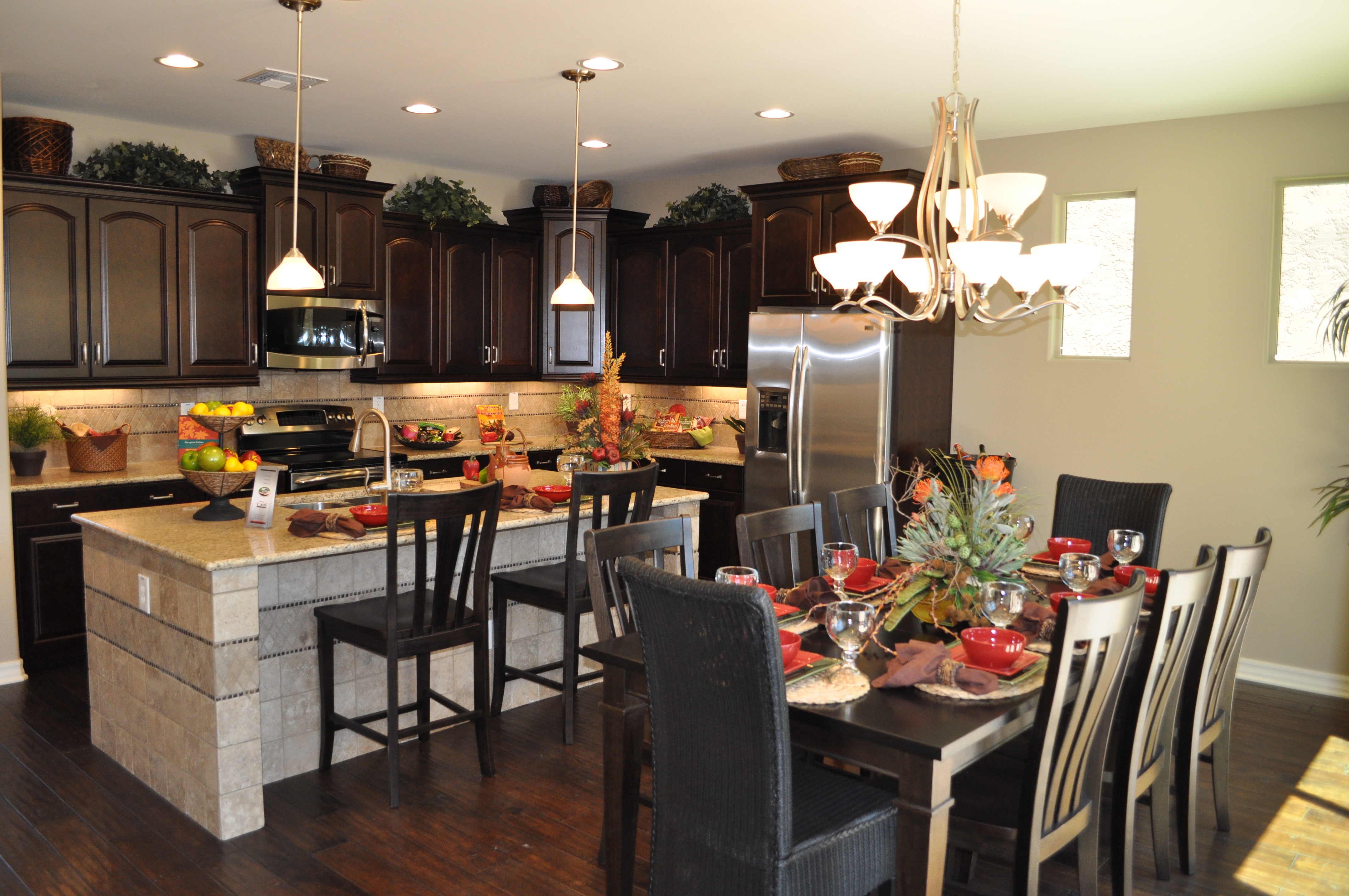
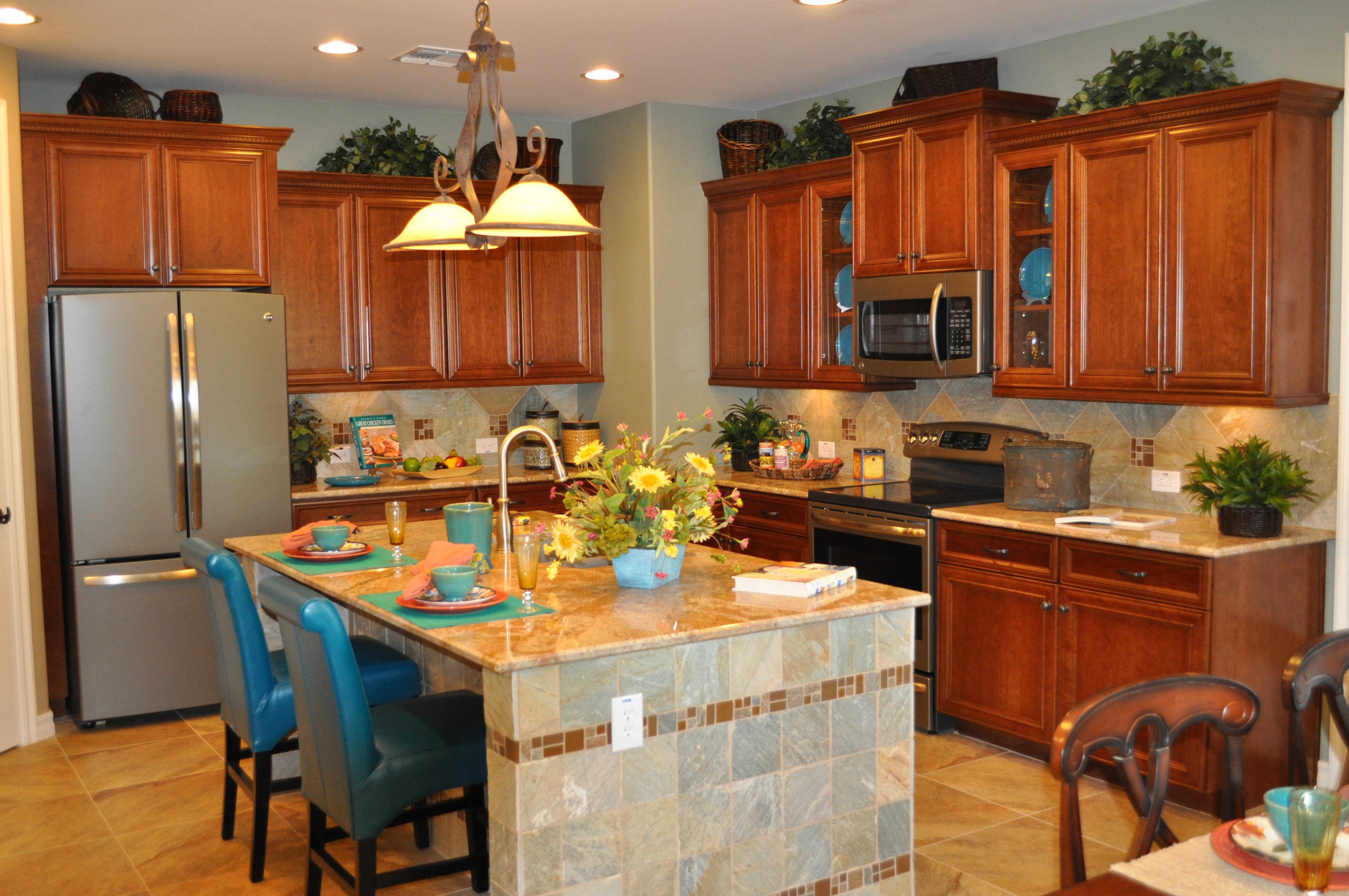
This kitchen and family room, from the Fulton Homes Cascade model, demonstrates smart ways to introduce color. Let’s take a look.

Glass cabinet displays: Glass in several upper cabinets opens up a space and adds personality. This kitchen takes advantage of the visual by displaying blue plates. Notice that the tile on the side of the island has a blue cast, and this color is carried throughout the kitchen.

Island chairs: Selecting chairs to match the cabinets would be a safe choice, but lacking in creativity. This blue leather brings the plate colors to the other side of the kitchen while the wipe off finish makes them perfect for coping with after-school snack accidents.

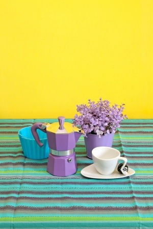
Accessories: Placemats, dishes and flowers pull more colors into the space. Other counter accessories and even the items above the cabinets can carry a colorful theme throughout the room.

Family and Kitchen DSC_0306 outdoor connection
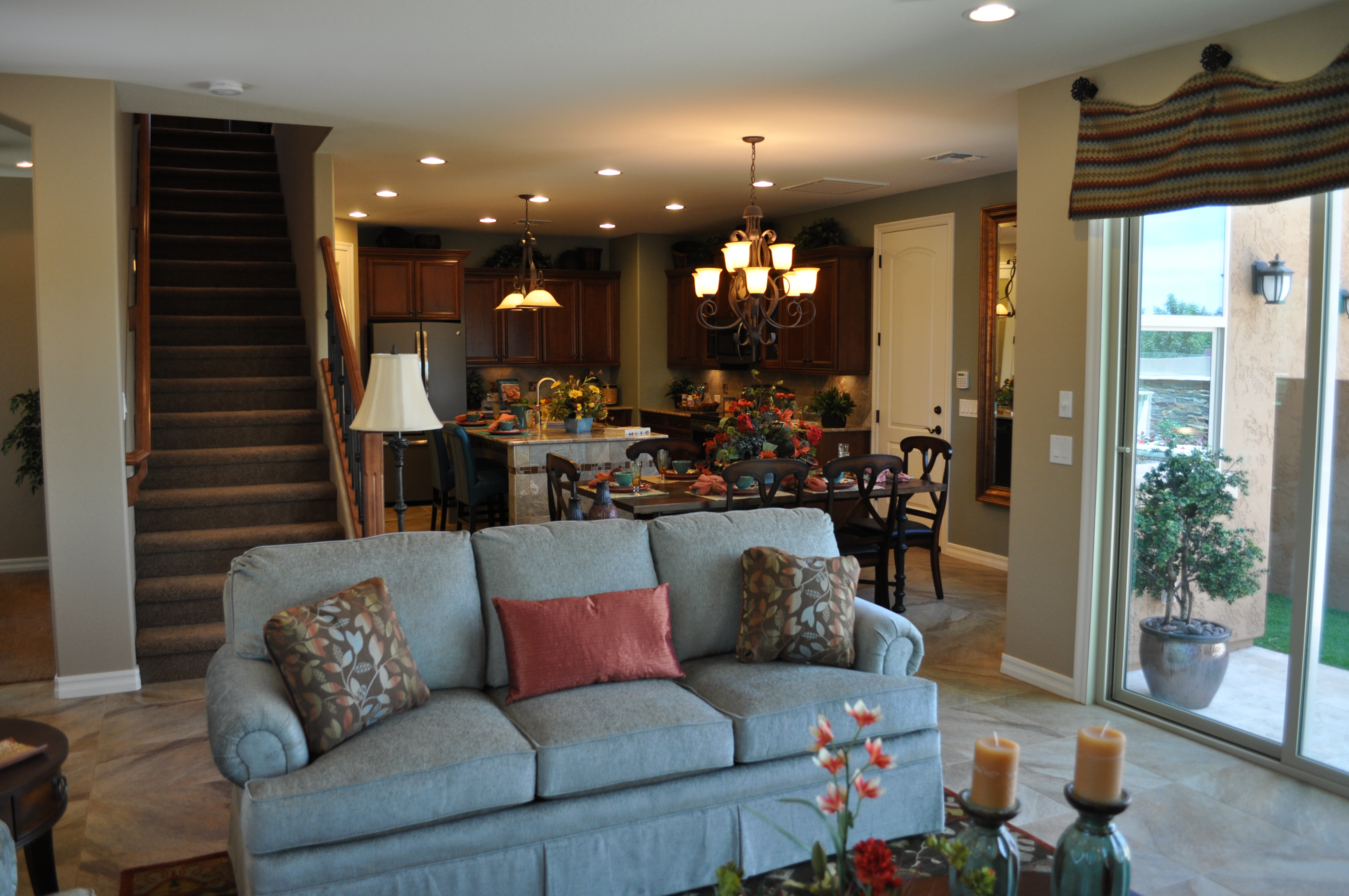
Family room coordination: The family room provides more opportunities to introduce color, and the sofa, window treatments, accessories and throw pillows echo the kitchen colors. \

These choices keep color front-and-center in this family-friendly space. Blue and rust bring the space to life. What colors would you like to see in your kitchen and family room? Whatever you choose, color will warm your home and add interest while saying welcome to you and your guests.

Don’t be afraid of color

Loft DSC_0312 don't be afraid of color
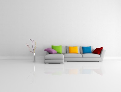
When it comes to larger furniture investments, many people are hesitant to choose color, preferring instead to stick with neutrals. But color creates its own magic, as you can see with these two rooms from the Fulton Homes Cascade model.

You can bring color into a room with less committed options such as paint and pillows, but take a look at how appealing this loft room is thanks to the inviting blue on the sofas and the fun stripe on the coordinating chairs.

Color makes a space interesting. Too many neutrals and you can have a home that looks more like commercial space. Why not show off your color preferences? In this room the soft light-brown carpeting and gold walls provide the neutral tones and then the blue becomes a strong focal point rather than the television.

A red-orange ottoman pulls the pillow and throw colors into the room while the slipper chairs with their stripe play a nice supporting role. Patterns and solid fabrics play well together, creating the feel of a family-only space appealing to kids and adults alike.

Master bedroom DSC_0317 - don't be afraid of color
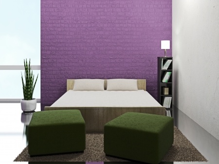
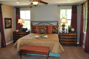
Not quite ready for prime-time color? How about dipping your toe into the pool with a focus wall such as the one in the photo to the right? The contrast between the light blue and the brown and rust colors from the bedding and curtains works well to keep color front-and-center in this master bedroom.

Blue and brown work well together, creating a sophisticated color palette. If you want to get started with color, you might enjoy visiting a shop that carries upholstery-weight fabric. Choose a colorful print that appeals to you and build your room around it. You may find yourself saying yes to color in your home in ways you would never have imagined.

Linking Kitchen and Dining Spaces

Kitchen20and20Nook20DSC_0244With an open floor plan it’s easy to connect with friends and family when fixing a meal. The distance to the table is short, making the transfer of food to table and dirty dishes back only a few steps.

If you have lived in a home without this kind of space, an open floor plan is a luxury indeed. But planning the décor requires attention to make the space feel unified. This Fulton Home model demonstrates how to connect the kitchen with the dining space. Let’s take a look at some of the decisions that make this space work so well.

Flooring: By staying with dark wood flooring throughout, everything feels like one room. The island provides the only break between the kitchen and dining table.

Cabinetry & Furniture: The cabinetry in the kitchen and the dining table and chairs coordinate in wood tone. Another connection comes when the chairs at the island sport the same design as the dining chairs. This keeps the one-room feeling intact.

Lighting: Although the pendant lighting above the island has a different function than the chandelier in the dining area, the glass globes are the same shape and both have the same brass finish. They are from the same family of lighting fixtures and they help integrate the space beautifully.

Accessories & Colors: The dishes, flowers and kitchen décor mirror the dining table’s tablescape. This causes your eyes to travel freely around the entire space without a pause. A difference in color or style from kitchen to dining room could create a jarring interruption.

If you are moving to a home with an open floor plan for the first time, be sure to factor the need to integrate several spaces into your design and décor plans.

Personalize your Home: Color

15825954_SDo you find yourself always choosing “safe” neutrals when you make a purchase for your home? Well, maybe it’s time to add some of your favorite colors!

If you’re not sure where to begin, take a look at these ideas to kick-start color in your décor.

It’s just paint: This seems like a daring place to add color, but it’s actually one of the easiest and least expensive ways to change a space. Here’s a suggestion. When you’re looking at paint samples, move down the color cards to the rich darker tones at the bottom. Then get sample pots of several of your lighter choices and a few of the brightest hues.

Now, challenge yourself to paint at least one wall with the vivid shade. Use the sample pots to see which wall and which color works best for you. Be sure to live with those sample colors for at least a week. You may find that a color that was startling at first grows on you over time.

20700581_SPlant a pocket of color: Whether it’s bookshelves, a guest room or some simple storage in the kitchen, consider adding a splash of various colors in combination. Take a look at how appealing the vivid mix of tones appears on the right. Simple lines pop when you add color to the mix.

Take a chance: Instead of a brown leather sofa, how about choosing one of the colors shown below? The rich blue, warm olive green, or even one of the daring reds could turn your safe living or family room into something dramatic and inviting.

Does a sofa seem just too much? Why don’t you start with a chair; then add some color in a rug. You never know, you may end up with a home as bright and colorful as you are!19877392_S

Silver Gives a Touch of Winter

5602580_SIf you have children – particularly little girls – you’ve probably seen Frozen. The story, the music and the characters are delightful, and the scenery really puts winter front and center.

For those of us who live in Arizona, winter is not the icy adventure presented in the Disney movie, but you can bring a hint of winter’s splendor into your home using silver.

More and more, metallic paints liven up old pieces of furniture such as the bombe chest shown in this photo. Add an old-style upholstered chair and ottoman with silver leaf on the wood and rich modern black and silver upholstery, and you’re headed for your own winter design.

Black is the perfect pairing with the shine of silver, setting it off while providing the perfect addition of drama. Notice the dark burgundy silk throw pillow – a touch of dark red or turquoise will spark the black and silver with a bit of color. The silver-framed mirror, chandelier visible through the glass, and the selection of silver accessories finish up the room into something you would expect to see in Elsa the queen of Arendelle’s bedroom.

19419998_SYou can create your own silver furniture simply. Look in thrift and antique shops for a table, chair or framed mirror with some character such as the occasional table in the photo to the right. Choose something inexpensive, possibly with a damaged finish, so you aren’t covering a beautiful patina with paint.

Wash the piece and sand lightly. Before painting, wipe it down with a tack cloth to remove any dust. Look for a good quality silver spray paint. Take it outside to protect yourself against the fumes and set it on a drop cloth or newspapers to protect your landscaping. Spray the piece, using several light coats to finish it completely.

So maybe you really don’t want to recreate a Disney film set in your home. You can still bring a bit of winter silver to a corner of any room that could benefit from the additional splendor.

Making 2014’s Top Color Work in Your Home

25272599_SPantone, one of the most influential color companies in the world, selected its 2014 color of the year: Radiant Orchid. Soon you will see clothes, accessories, and home elements such as wallpaper, paint and linens in this vibrant shade.

If you’d like to incorporate Radiant Orchid into your life, here are a few suggestions, ranging from all out to a simple touch of this warm mid-tone lavender.

One inviting option involves paintable textured wallpaper and just the right shade of paint. This accent wall captures the feeling of Radiant Orchid, using a slightly darker tone to ground the wall.

11879796_SIntroducing a pop of the color in one strong block gives you the impact you want while making it easy to change in a few years if you fall in love with another color. Surrounding this wall with neutrals and bringing in a rich green – the natural complementary color for purple – allows the wall to draw the eye without overpowering the rest of the room.

If you want to incorporate this Radiant color into your everyday life without a large investment of time, space or dollars, look for small functional home items to spark up your bathroom or kitchen. This espresso maker adds a splash of Orchid, and the tablecloth supports this with stripes that pull purples in as well as other colors to balance the look.

10643751_SMaking this type of decorating choice allows you to play with trending colors while still maintaining the longer-term look and style you enjoy. Combining trendy with classic elements such as the white cup and saucer shown provides a design balance that’s fun with staying power.

One final option: how about going simple by adding an actual orchid in Pantone’s radiant color such as this one to the left? After all, long before Pantone selected this color for 2014, nature had it featured in a number of its finest products!

Design Inspiration: Set a Sunny Mood

9417150_SDesigners will use many things for inspiration. They may think of a movie, a historic time period, a specific style or color, or they may choose something vaguer – something that sets a mood rather than openly defining their inspiration.

This week let’s consider a “what if.” What if weather provided design inspiration? With Fulton’s metropolitan Phoenix location, the obvious first choice is sunshine.

This room announces a sunny day with floor-to-ceiling windows flooded with light. The dark wood window trim makes a strong contrast to the bright view outside and the light colors inside. Choosing deep orange echoes the sunny mood without being obvious while the bright citrus green chair and coffee table provide the clear colors that appear with sunshine.

Although the sky outside is a cool light blue, the expectation of a strong bright blue sky appears with the contemporary light fixture in an inviting blue/teal. A few live plants bring us that much closer to being outside in the sun.

12760827_SA sunny mood is relatively easy to demonstrate with these windows and all the sunshine as support, but what if you wanted to create a sunny mood without the outdoor advantages? Take a look at this photo to the right.

This kitchen feels sunny and bright in spite of using only artificial light. What did the designer do here to make that happen?

Using white cabinets sets the light mood, and pops of bright colors – particularly yellow – carry the message forward. The countertops are also light and the cutting board is a honey tone that feels mellowed in the sunshine.

Finally, the lighting splashes light down on the cabinet doors and under the cabinets. Add the reflections from the stainless steel range, hood, and kitchen accessories and sunshine seems to have been captured in this space. And while we take sunshine for granted in Arizona, other parts of the world can benefit from creating a sunny space indoors to compensate for grey skies outside.

Decorating with Your Colors

11052685_SWhen you were little, chances are you didn’t limit yourself with color. Drawing with crayons, colored pencils or paints, most children will use almost every color in the box.

What happens when we grow up? Suddenly we seem to limit ourselves to a very few options from the rich selection available. Walk through your home and peek in your closet. How many of these colors can you find? Are you seeing lots of the grey, brown and black, or are you letting your bright side show?

8064776_SHere’s a low-risk introduction to more color. Throw pillows are inexpensive, portable and temporary. This room shows what it looks like when you dip your toe into color. It’s better, but it’s a pretty wimpy leap into the spectrum.

Take a look at the vignette below. Here colors play a starring role. The chest grabs six different hues from the pencils above, and the vases and pot add more. The neutral background and flooring and splashes of black simply showcase the colors more strongly.

8960162_SWhat was your favorite color as a child? Do you see it in your home? Purchase a box of crayons and count the colors you see in your life now. Have you accidently gone kind of taupe? It’s time to make a change.

Pick out your favorite crayons from the box and go shopping. Would you like a bright blue vase? How about a red glass bowl or a yellow side table? Have some candlesticks that you’re tired of – how about spray painting them all orange and setting them on a table together?

Bring your favorite colors back into your life – in your home and your wardrobe. You may be surprised at how well they brighten your days.

Décor Choices Bring the Sun Inside

5128757_SWe’re fortunate here in Arizona to live in a climate that gives us so many sunny days. In many parts of the country, this time of year presents gray, dark weather with plenty of rain and snow. But no matter the weather outside, you can bring the sun into your home by choosing the right colors, accessories and fabrics.

Take a look at the curtains in the photo to the left. The soft rust tone of one curtain combined with the second rich gold fabric curving over the top feels like a perfect balance of sunshine and shadow. The metallic layer on the gold curtain adds shine to the sunshine message, and the sparkles on the two-tone tassel also contribute.

10866785_SIt may be tempting to stay with the bright gold shades, but notice what happens in this photo thanks to the darker rusty orange. The contrast makes the gold seem even brighter and stronger. When you decorate your home, it’s best to use contrast to emphasize your style. Staying in the same tone range creates an uninteresting room. In this shot the contrast comes through in several ways: on the fabric, tassel and the braided tie holding the upper curtain back.

You don’t have to go for the traditional, almost baroque feel shown above to bring sunshine into your home. Take a look at the photo to the right.

Orange, gold and brown work together to create a sunny space. The metallic gold art is brightened by the contrasting dark mats and frames. In the same way, the metallic decorations on the pillows and bed runners really pop thanks to the dark brown base of the ribbon. Notice how that orange wall has depth and power. It probably took three or more coats of paint to obtain that richness.

Do you want a room that spells out sunshine? Consider these colors and an introduction of warm metallic elements to bring the sun into any room in your home.

The Decorating Power of Red

8161349_SRed is daring. Red is romantic. Red is sexy. That’s one reason why it’s the color of Valentine’s Day. A splash of red makes an outfit come alive. Whether you love red or not, the color is almost impossible to ignore.

In honor of the holiday, how about looking at red in decorating? Here are three variations on using red in your home, depending on just how daring you feel.

Hard-core red: This photo shows a room where red is the dominant color. This rich dark shade of red takes over the space. Red can be a great color for dining rooms because it raises the energy level in a room and draws people together, encouraging conversation. Your dinner parties could be livelier with red walls.

The secret to this type of luminous and rich red color on your walls is multiple coats of paint. Stop at one or two and you will end up with a red that looks washed out and flat. Plan on at least three coats, and consider five. It’s a lot more work, but getting a result like this makes the effort worthwhile. Also, notice that the rest of the room’s decor is fairly neutral. Once you commit to red, really watch out for any other color choices. Red like this is generally enough color for one space.

2409263_SA splash of red: By choosing red leather for this dining room’s chairs, the homeowner adds style and a spark to the space. Once again, neutrals keep the red to the forefront without having the color overwhelm the room. You may notice that the brown flowers in the rug look almost rust against the red. This actually works because of the extremely neutral effect of the rest of the room. The red chairs ensure that the table is the focal point of the room. Remember that your eye will always be drawn to any red in your home.

8961688_SJust a touch of red: If you’re not ready to jump into the world of red full-blast, how about dipping a toe in? This light fixture provides a dramatic impact in the room and saves it from a boring neutral look. If a permanent fixture seems too extreme, how about adding in a couple of throw pillows or a vase? You could even test out your red comfort zone with a bouquet of red flowers. But you might want to wait until later in the month – those red blooms are quite expensive at the moment!